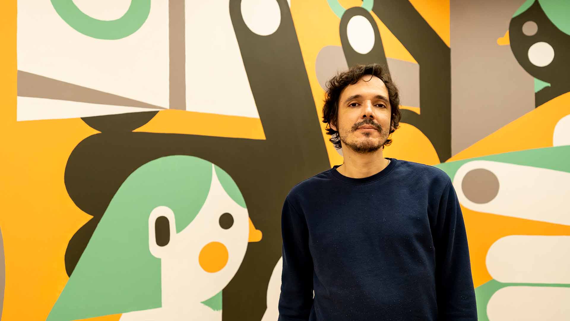
Design Collaboration | January 2022
Portuguese illustrator Tiago Galo’s thoughts on creativity: “Avoid the obvious.”
Design Collaboration | January 2022
Portuguese illustrator Tiago Galo’s thoughts on creativity: “Avoid the obvious.”
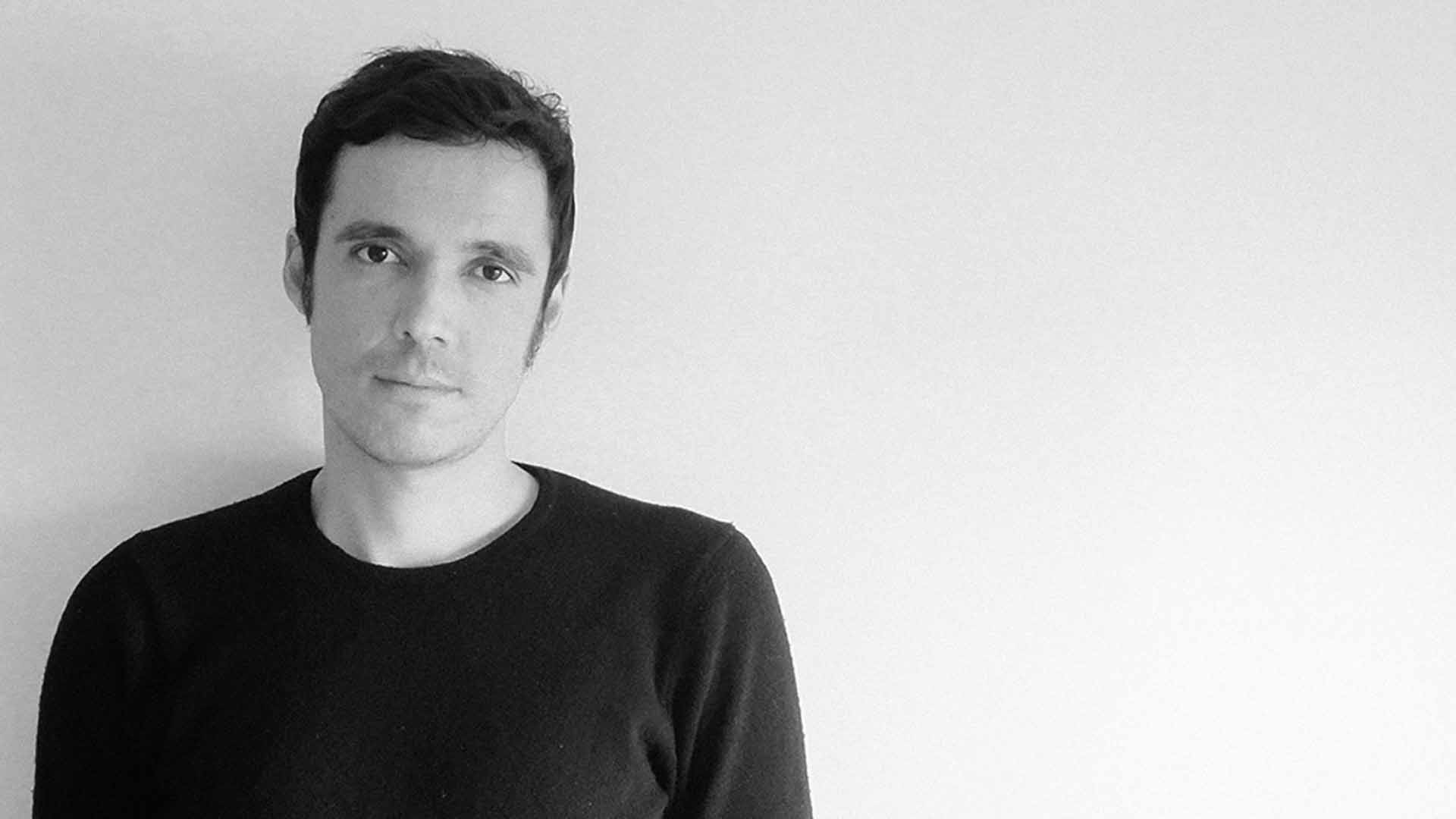
Tiago Galo is a Portuguese illustrator based in Lisbon and collaborating within Designergatan’s network of creative professionals. His first project was to design illustrations for the company’s website.
Working with Herman Talvitie on the website illustrations was cool, it was an integrated kind of work. Herman and I reflected on the illustrations together, both the design and what it should communicate. In the beginning, he showed me the already existing site, the colors and those themed letters with different font sizes. Part of the job was also to interpret that, to bring illustrations to the existing graphical world, with the colors, the blue and the yellow.
I think it was a little bit out of the box for a design company to put such an emphasis on illustrations. In my experience they usually go more for the technical design part. I think Herman also wants to connect more with his clients through the illustrations, he wants that people can relate with each other.
Designergatan has its own style, Herman really stands out. Many companies in this sector have a kind of gentrification in their work. Many people are relying too much on the mockups and stuff already available on the internet, which is then easy to personalize. There are people who make a living out of that, they have the templates, they adjust a little here and there and then sell it to the clients. I think it’s really cool what Designergatan is doing, standing out of this.
“Illustrations give more space for imagination than photos.”
When Herman Talvitie started designing his website, he was initially thinking he could use stock photos, but then soon changed them into his own photos. He had his brand guideline available, the logo, the colors and the graphic elements, but felt a little insecure about the style. He liked the black-and-white photos, but he thought it wasn’t enough. Then he got the idea that illustrations might work as well, as they portrayed more freely what Designergatan does and wants to do. Illustrations give more space for imagination than photos. With the illustrations he wanted to tell the story of his company. He gave me a free hand to start working on them.
It was great as I usually don’t get to have this kind of projects. Usually, my clients have a very established idea. Sometimes it is hard to get them to see my vision. Our collaboration started with a conversation about his website. He said that it would be great if I gave my vision of what could be good, not only regarding the illustrations, but the whole site. It was important to have an outside view from an illustrator and I was happy to do it.
I gave him some thoughts on how I could interpret each of the situations he gave me to illustrate. We talked on Skype first, talked about all kind of things and about the facts, and scheduled another meeting after we had some thoughts on the design. I made some mockups with the print screens and we discussed them. It was really a joint collaboration. He also gave me his insights on the illustrations, on what would work and what wouldn’t.
We didn’t have any problems as he liked the way I conceptualized the images, so that really worked for him. He was happy with it and he liked the way we worked, so he asked me to expand to more illustrations and also some small icons.
I told him that maybe if we did that amount of illustrations – and when I refer to illustrations I’m talking about the relationship between the characters like we have on the site – I said that maybe that would be too much. People would see the website as an illustration or something more graphic, and put their ideas towards an illustration company.
“We had to find a middle ground between the illustrations and the information to convey through the site.”
I suggested making some little icons instead and some graphical tweaks here and there. We went for that as it balanced the site more, having a compromise between illustrations and the rest of the information. We had to find a middle ground between the illustrations and the information to convey through the site.
At one point it felt as if the illustrations stood out too much. And then people would look straight at them when visiting the site, and they would subconsciously focus only on the illustrations, and possibly put aside some of the important information. We really had to work on that, it was the most important part of the work since the illustrations were already there and the style was already working. But that was cool, we worked on how we could put more elements here or take out elements there. It was like a puzzle to make it all fit into the website.
“The thing is, when people get along and they respect each other, I think that’s already half of the job.”
I would define Designergatan as a great collaborating partner. It was very international, the company being in Finland and working with a Portuguese professional like me. Herman is a really reliable person. That was important, and he had a respect for my opinion and my vision. The thing is, when people get along and they respect each other, I think that’s already half of the job. And that worked well with us. We didn’t have any problems. He was open to my propositions, and he listened to my concerns and my opinions.
Building a network of creative professionals is his philosophy that he is also trying to bring to the world of IT. To UX, User Experience, and the projects. He is trying to bring something new to this discipline. That is something you don’t see very often nowadays as there are really defined trends on how things should be. When you open a website it’s really the same everywhere. You just change the logo and the stock images, it’s boring. There are so many opportunities of doing things in a new and refreshing way, and people visit websites and the internet every day. It’s like a storefront, like you go to an avenue and all the stores are the same. The way he is trying to change things through his experience. The way he communicates on his website, he tries to bring the problem to the table, it makes a lot of sense to me. I definitely like his philosophy.
“There is freedom within this community.”
I feel lucky to be part of the Designergatan creative network community. He asked me if I would be interested in being part of this network. I said of course, I really identify myself with the things you are trying to bring to your discipline, so yes, I’m in! There is freedom within this community. Everyone has a voice. It’s not like he says I need some illustrations, I want them to be like this. No. I think his philosophy is to bring the insights from everyone, to make the project richer that way. Everyone brings something from themselves, their own expertise. So that is his philosophy and I’m really in 100 % with that and I’m happy to.
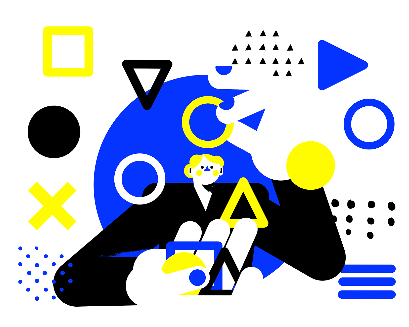
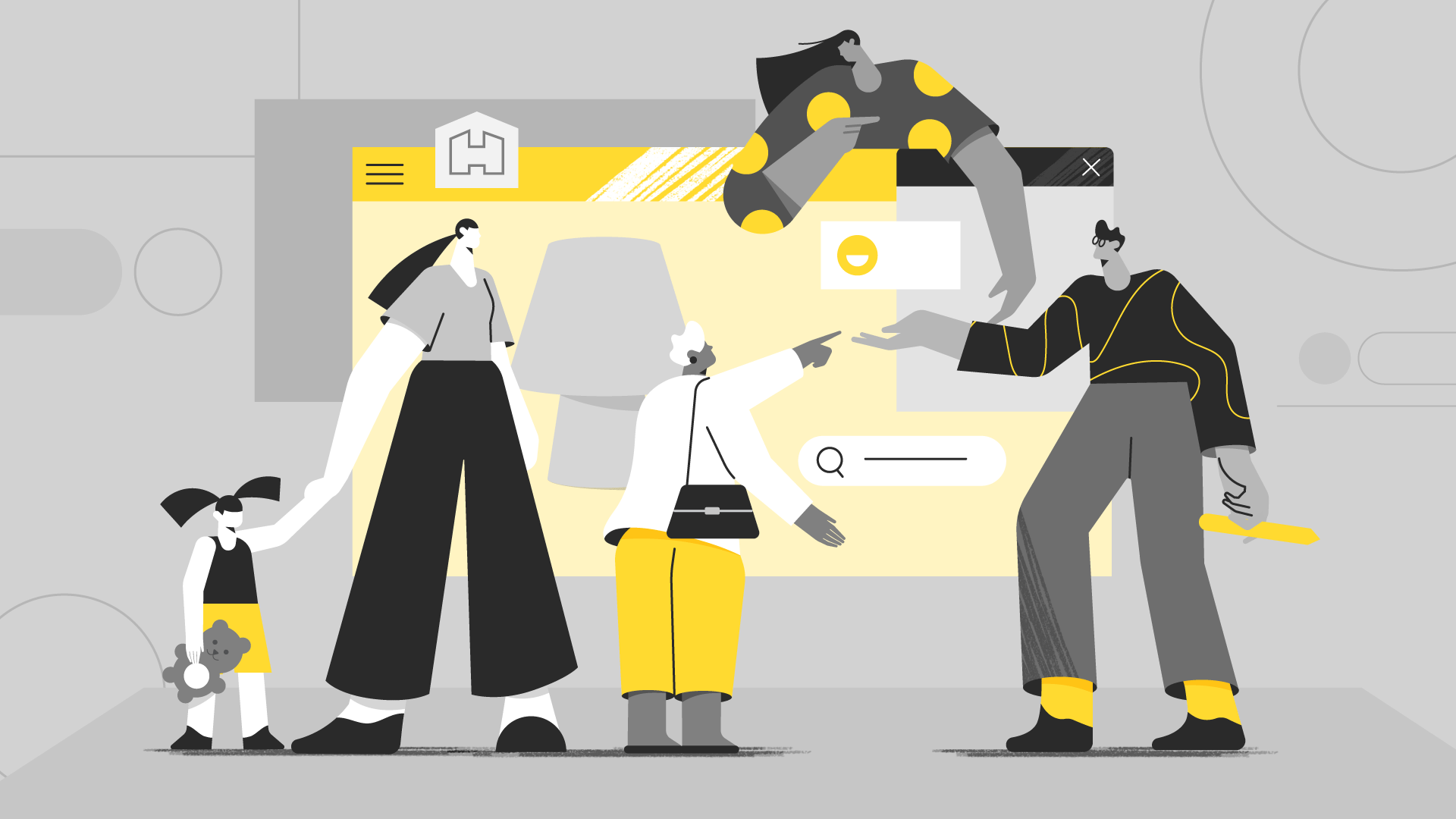
This animated illustration on the Designergatan website was an illustration that he wanted on the front page. It shows the disciplines inside the user experience job. There is a woman and a man looking at geometric figures, thinking about the way they could work together.
It also shows the woman working, bringing her personal side to a project. You bring something that is personal and something that is not done from anywhere. You bring it from yourself. I wanted to make it engaging at first. It was not to see this discipline as something that was ready and you just buy it like a package. It’s something that you bring your ideas and your own personal doubts and solutions to, and we can all discuss them, and also have an opinion on how things could work. That’s what the man is looking at on the screen. And some of the different relations between these icons are making different arrangements, different pages.
It’s on the personalized side of this discipline, user interface design and communication. It’s the individual side versus the premade stuff that every site nowadays is about. It is really important to define an objective problem and solution, and work together to find a common ground for everyone. To have a personalized solution for your problem. The way you communicate. It was something like that. The first idea.
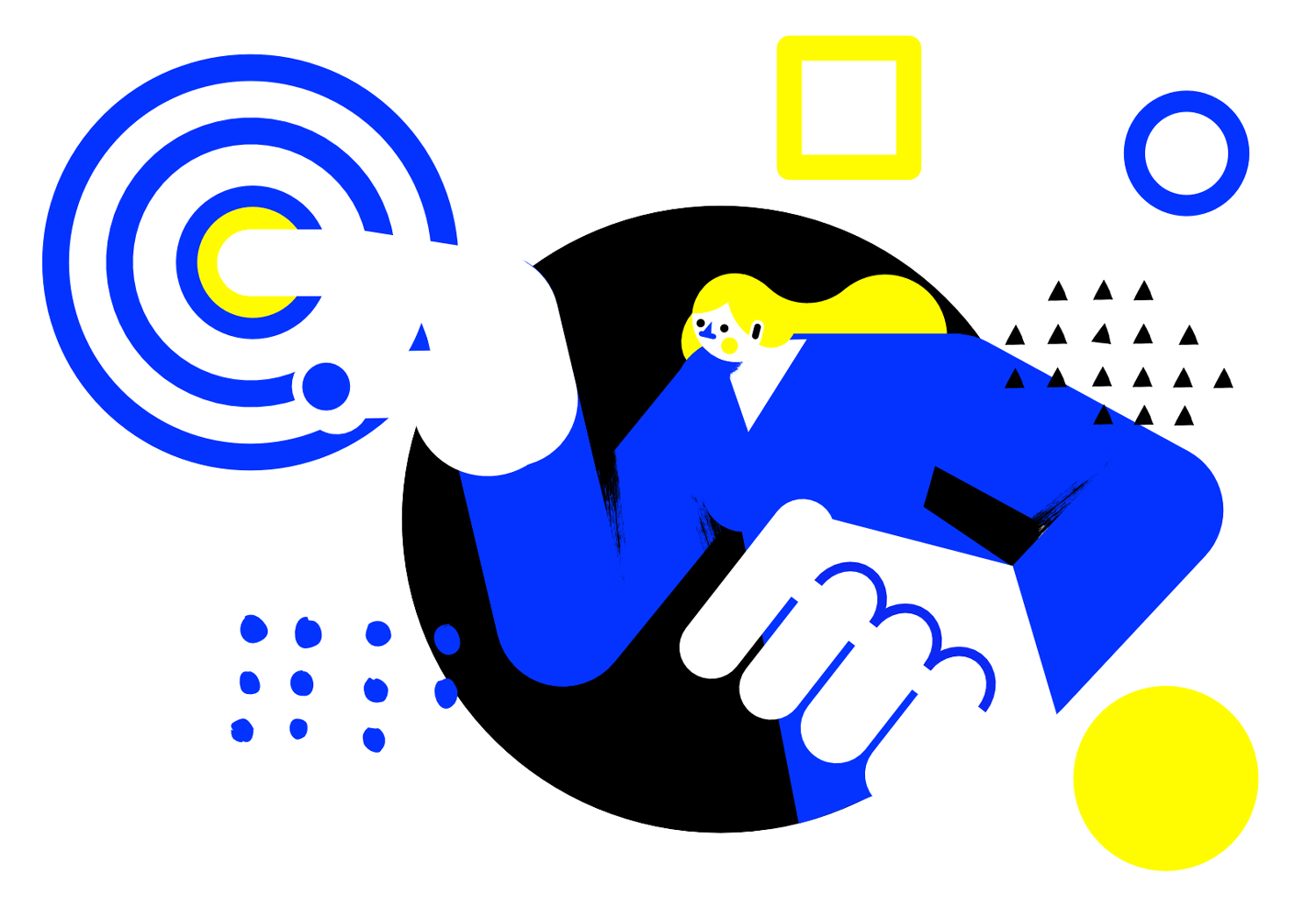
My creative process started with focusing on the way the website was built. The geometric shapes that were integrated, squares and stuff like that were there prior to the design that I made. For example, the yellow square, I tried to bring the items to the illustrations. There were also some circles. That was the first approach to the graphic part of the site.
“I brought in a little of my own universe, the way I draw the characters, and then just combined the two worlds.”
I think it was really interesting, the way he was using those shapes. It engaged to look at certain parts of the website. It was great to interact with those shapes. The colors and the shapes, that was my starting point. I brought in a little of my own universe, the way I draw the characters, and then just combined the two worlds. It was really easy to create this as my first ideas were approved by him, he liked them and we both thought they would work together. And they did. Our two kind of worlds, the way we communicated with each other, his expressions and my own expressions. They worked well together. It was really easy.
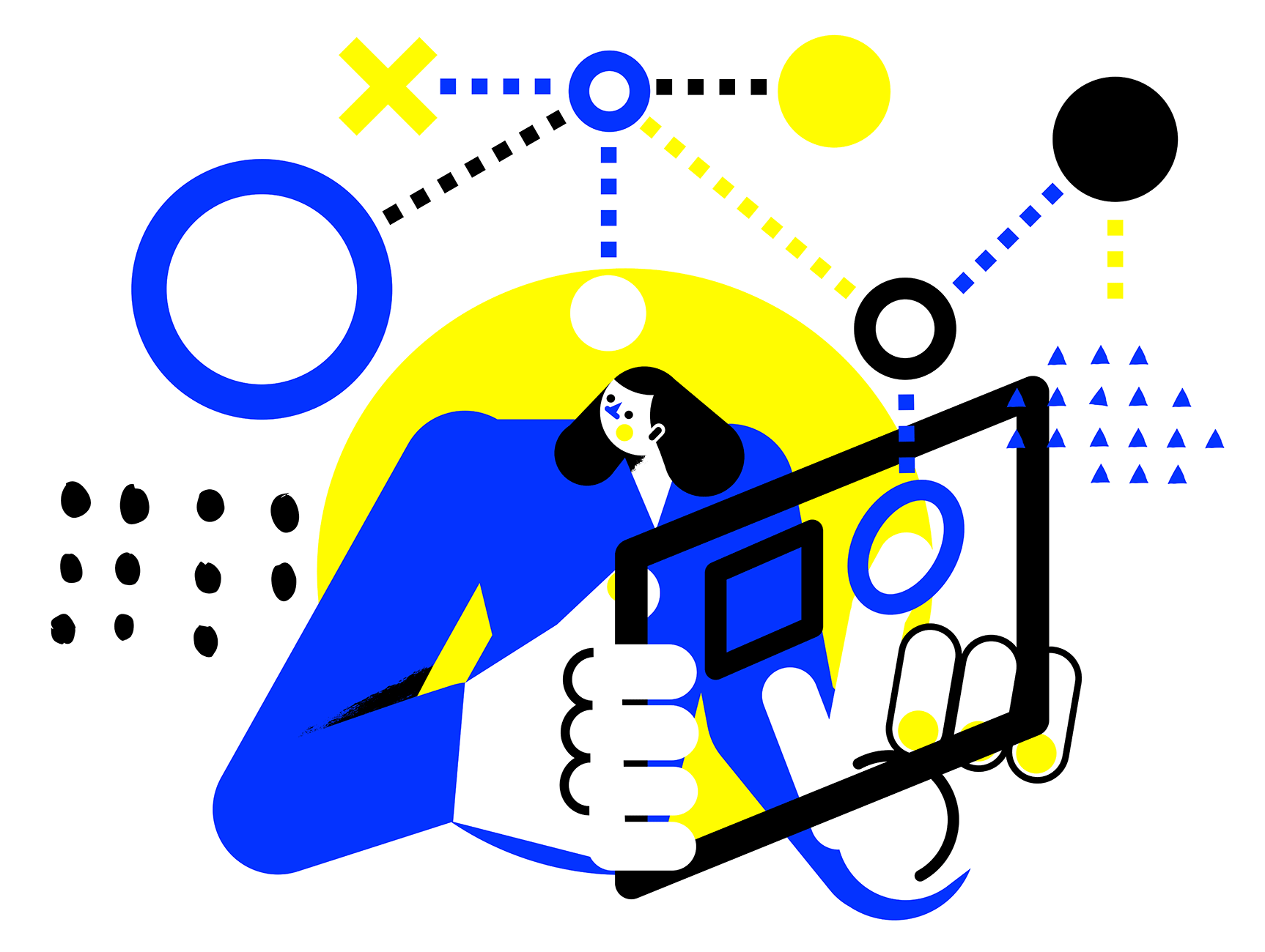
In the beginning the challenge was balancing and making sure the illustrations and the graphics wouldn’t take too much of the focus. I was a little bit concerned about that – also about the size of the illustrations, what size they would be on the website.
When he asked me for more illustrations, we decided that it would be too much, that we should instead just make some small tweaks here and there with the icons, and not put too much information on the site of the illustrated part.
Sometimes creativity is being blocked a little upon starting. I work a lot with editorial sites, so I make some designs for magazines and newspapers. Sometimes the problem with these jobs is the time frame for the work. Imagine you have a magazine that will go out next week, or a newspaper that has an article that will go out in two days. And they ask you for an illustration for that. Sometimes it’s hard for getting an immediate idea and to really do something. I’m not proud of all the designs I did in the past. But that’s something that really improves. Your brain adapts to the process and you already have your tool, the concepts that you have been gathering from each job.
I started five years ago with illustrations, and at first it was difficult to ride that train because it was going too fast. But now it is much easier for me to idealize a concept automatically, to draw it and present it to the clients than it was three or four years ago.
I think that’s all adjustable, we all adjust to the things we’re engaged in. And if you love what you’re doing, like in my case – it’s my hobby, it’s my work – so I’m really interested in the things that I do.
“There’s no such thing as fast creativity.”
Working with Designergatan was also great as there was no time pressure. Take your time, Herman said. He is a very relaxed person. He knows that creativity requires time. There’s no such thing as fast creativity. When two people are on the same page, you get the job done.
I really try to avoid working under too much time pressure. Some years ago, I had a bunch of projects on bitcoins. My first approach on that was don’t design a person with a bitcoin in his hands. I wanted to approach the problem from the other side.
You just have to try to focus on what you won’t do. I think it gives you lots of pressure, to do things the opposite way. But I was not trying to find a solution, I was just putting aside all the possible solutions that everybody else uses. Illustrations with bitcoins and all the insertions that are the same – with the computers, and the clients with a B, and stuff like that. I said, no, that won’t work, I have to get out of the box. I always try to think like that. My trick is, don’t do the obvious. Avoid the obvious. That’s my first approach to everything.
A few words about my professional background: I studied to become an architect. I worked as an architect for ten years. And then, I quit, it just wasn’t for me. It’s not that I don’t love architecture, I really do. But the way things are in terms of architecture here in this country is not the way I idealized the process when I was studying the subject.
Already in high school, my passion was illustrating. Here in Portugal, it is hard to be an illustrator, so I went for architecture. But then, ten years after working, I participated in a big competition, in a big illustration comic festival, and I won the first prize.
“I really love my job, I think it’s the perfect job for me.”
I was still working as an architect. And that was like a wake-up call. No, maybe I can make this work, you know. Maybe I should make this into a living. I quit my job and I wanted to give it a try. It was hard during the first year because I didn’t have any connections. I started from zero, from the ground. Well, I just had this philosophy of making one illustration a day and posting it on my social media and networks. It was engaging. People started commenting and liking my illustrations. I built some engagement out of that, of having one illustration a day. And then suddenly I was contacted from newspapers, magazines, from here and from there. Now I have been a full-time illustrator for five years. I really love my job, I think it’s the perfect job for me.
“The trust that Designergatan brings to the table.”
To sum up working with Designergatan and the illustrations I made for Herman. It was really pleasant, working with such a sensible person. He is very open to your opinion and expertise and he respects you. It’s almost impossible not to like Herman. That gives you a sense of also wanting to give him something. He trusts you so much you don’t want to let him down. That’s the basic point of working with Herman. The trust that Designergatan brings to the table. You feel like he trusts you and you feel that you have to trust him back and make the best possible job. And he trusts you and wants to see what you have to say and bring to the project. Trust. Trust would be the word that I would use to describe everything about our collaboration.
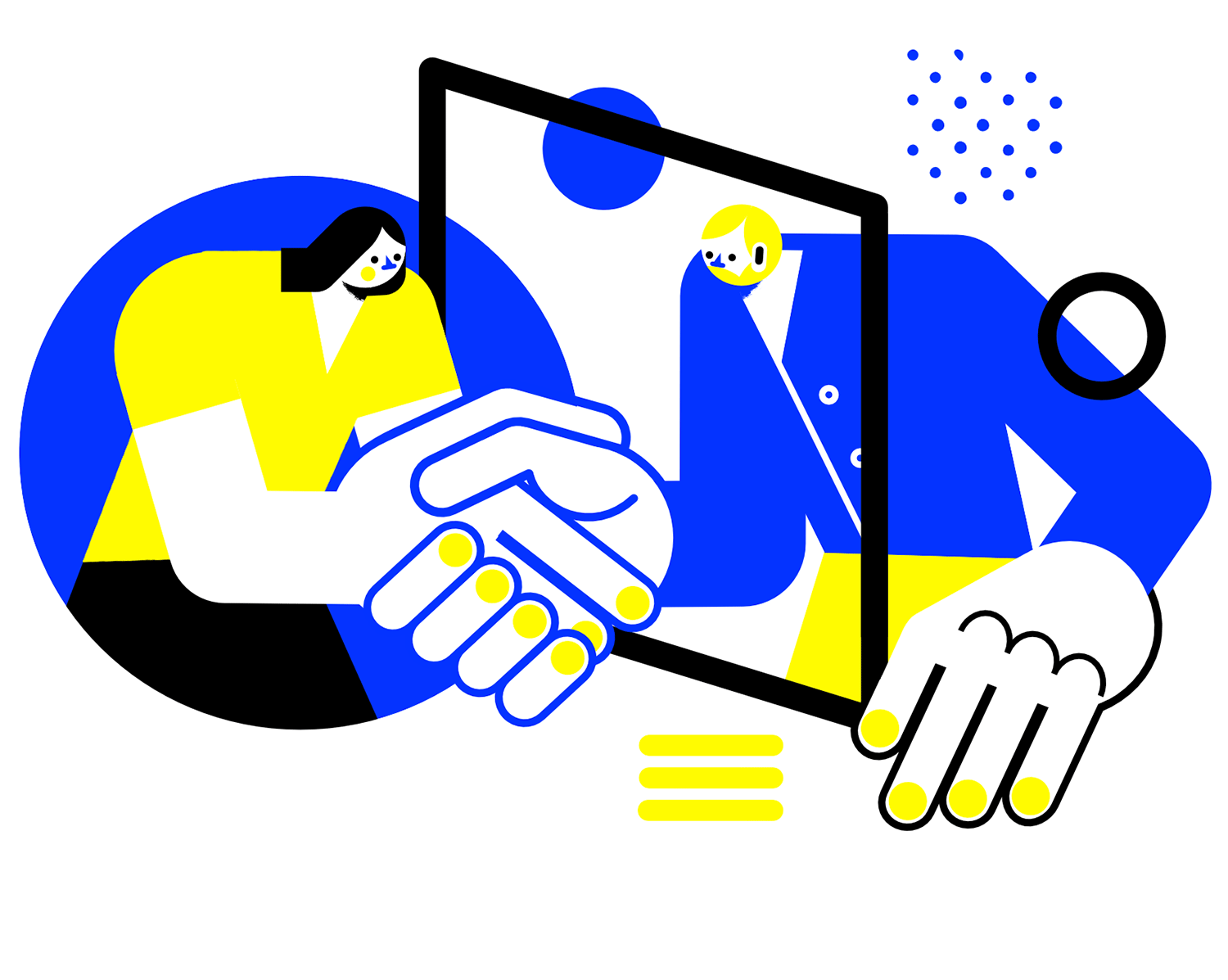
The illustrations became bold and colorful. That would be the two main words that I would choose to describe them. Colorful, the colors I used were really strong colors, just like the colors of the Designergatan website. And bold since they tried to connect, like in your face, they’re not subtle. Further, they just don’t go along the website in a way that you discover them slowly. No, they bring it on when you open it. So I would say, colorful and bold.
Tiago Galo is a Portuguese illustrator based in Lisbon. He started his work as an illustrator collaborating in small fanzines and exhibitions, before finishing his degree in architecture at Universidade Técnica de Lisboa. In 2011 he won the prize for the best comic at the Amadora BD competition. In 2014 he finished the Art Direction degree at Edit Creative School in Lisbon. After some years working as an architect he engaged in some kind of soul-searching wondering and returned to his work as an illustrator. Currently he works as a freelance designer and illustrator. Some of his clients include The Hollywood Reporter, Flipboard, National Geographic Travel, Penguin Random House, Casa da Música, Financial Times, Canadian Business Magazine and Condé Nast Traveler.
Tiago Galo is a Portuguese illustrator based in Lisbon and collaborating within Designergatan’s network of creative professionals. His first project was to design illustrations for the company’s website.
Working with Herman Talvitie on the website illustrations was cool, it was an integrated kind of work. Herman and I reflected on the illustrations together, both the design and what it should communicate. In the beginning, he showed me the already existing site, the colors and those themed letters with different font sizes. Part of the job was also to interpret that, to bring illustrations to the existing graphical world, with the colors, the blue and the yellow.
I think it was a little bit out of the box for a design company to put such an emphasis on illustrations. In my experience they usually go more for the technical design part. I think Herman also wants to connect more with his clients through the illustrations, he wants that people can relate with each other.
Designergatan has its own style, Herman really stands out. Many companies in this sector have a kind of gentrification in their work. Many people are relying too much on the mockups and stuff already available on the internet, which is then easy to personalize. There are people who make a living out of that, they have the templates, they adjust a little here and there and then sell it to the clients. I think it’s really cool what Designergatan is doing, standing out of this.
“Illustrations give more space for imagination than photos.”
When Herman Talvitie started designing his website, he was initially thinking he could use stock photos, but then soon changed them into his own photos. He had his brand guideline available, the logo, the colors and the graphic elements, but felt a little insecure about the style. He liked the black-and-white photos, but he thought it wasn’t enough. Then he got the idea that illustrations might work as well, as they portrayed more freely what Designergatan does and wants to do. Illustrations give more space for imagination than photos. With the illustrations he wanted to tell the story of his company. He gave me a free hand to start working on them.
It was great as I usually don’t get to have this kind of projects. Usually, my clients have a very established idea. Sometimes it is hard to get them to see my vision. Our collaboration started with a conversation about his website. He said that it would be great if I gave my vision of what could be good, not only regarding the illustrations, but the whole site. It was important to have an outside view from an illustrator and I was happy to do it.
I gave him some thoughts on how I could interpret each of the situations he gave me to illustrate. We talked on Skype first, talked about all kind of things and about the facts, and scheduled another meeting after we had some thoughts on the design. I made some mockups with the print screens and we discussed them. It was really a joint collaboration. He also gave me his insights on the illustrations, on what would work and what wouldn’t.
We didn’t have any problems as he liked the way I conceptualized the images, so that really worked for him. He was happy with it and he liked the way we worked, so he asked me to expand to more illustrations and also some small icons.
I told him that maybe if we did that amount of illustrations – and when I refer to illustrations I’m talking about the relationship between the characters like we have on the site – I said that maybe that would be too much. People would see the website as an illustration or something more graphic, and put their ideas towards an illustration company.
“We had to find a middle ground between the illustrations and the information to convey through the site.”
I suggested making some little icons instead and some graphical tweaks here and there. We went for that as it balanced the site more, having a compromise between illustrations and the rest of the information. We had to find a middle ground between the illustrations and the information to convey through the site.
At one point it felt as if the illustrations stood out too much. And then people would look straight at them when visiting the site, and they would subconsciously focus only on the illustrations, and possibly put aside some of the important information. We really had to work on that, it was the most important part of the work since the illustrations were already there and the style was already working. But that was cool, we worked on how we could put more elements here or take out elements there. It was like a puzzle to make it all fit into the website.
“The thing is, when people get along and they respect each other, I think that’s already half of the job.”
I would define Designergatan as a great collaborating partner. It was very international, the company being in Finland and working with a Portuguese professional like me. Herman is a really reliable person. That was important, and he had a respect for my opinion and my vision. The thing is, when people get along and they respect each other, I think that’s already half of the job. And that worked well with us. We didn’t have any problems. He was open to my propositions, and he listened to my concerns and my opinions.
Building a network of creative professionals is his philosophy that he is also trying to bring to the world of IT. To UX, User Experience, and the projects. He is trying to bring something new to this discipline. That is something you don’t see very often nowadays as there are really defined trends on how things should be. When you open a website it’s really the same everywhere. You just change the logo and the stock images, it’s boring. There are so many opportunities of doing things in a new and refreshing way, and people visit websites and the internet every day. It’s like a storefront, like you go to an avenue and all the stores are the same. The way he is trying to change things through his experience. The way he communicates on his website, he tries to bring the problem to the table, it makes a lot of sense to me. I definitely like his philosophy.
“There is freedom within this community.”
I feel lucky to be part of the Designergatan creative network community. He asked me if I would be interested in being part of this network. I said of course, I really identify myself with the things you are trying to bring to your discipline, so yes, I’m in! There is freedom within this community. Everyone has a voice. It’s not like he says I need some illustrations, I want them to be like this. No. I think his philosophy is to bring the insights from everyone, to make the project richer that way. Everyone brings something from themselves, their own expertise. So that is his philosophy and I’m really in 100 % with that and I’m happy to.
This animated illustration on the Designergatan website was an illustration that he wanted on the front page. It shows the disciplines inside the user experience job. There is a woman and a man looking at geometric figures, thinking about the way they could work together.
It also shows the woman working, bringing her personal side to a project. You bring something that is personal and something that is not done from anywhere. You bring it from yourself. I wanted to make it engaging at first. It was not to see this discipline as something that was ready and you just buy it like a package. It’s something that you bring your ideas and your own personal doubts and solutions to, and we can all discuss them, and also have an opinion on how things could work. That’s what the man is looking at on the screen. And some of the different relations between these icons are making different arrangements, different pages.
It’s on the personalized side of this discipline, user interface design and communication. It’s the individual side versus the premade stuff that every site nowadays is about. It is really important to define an objective problem and solution, and work together to find a common ground for everyone. To have a personalized solution for your problem. The way you communicate. It was something like that. The first idea.
My creative process started with focusing on the way the website was built. The geometric shapes that were integrated, squares and stuff like that were there prior to the design that I made. For example, the yellow square, I tried to bring the items to the illustrations. There were also some circles. That was the first approach to the graphic part of the site.
“I brought in a little of my own universe, the way I draw the characters, and then just combined the two worlds.”
I think it was really interesting, the way he was using those shapes. It engaged to look at certain parts of the website. It was great to interact with those shapes. The colors and the shapes, that was my starting point. I brought in a little of my own universe, the way I draw the characters, and then just combined the two worlds. It was really easy to create this as my first ideas were approved by him, he liked them and we both thought they would work together. And they did. Our two kind of worlds, the way we communicated with each other, his expressions and my own expressions. They worked well together. It was really easy.
In the beginning the challenge was balancing and making sure the illustrations and the graphics wouldn’t take too much of the focus. I was a little bit concerned about that – also about the size of the illustrations, what size they would be on the website.
When he asked me for more illustrations, we decided that it would be too much, that we should instead just make some small tweaks here and there with the icons, and not put too much information on the site of the illustrated part.
Sometimes creativity is being blocked a little upon starting. I work a lot with editorial sites, so I make some designs for magazines and newspapers. Sometimes the problem with these jobs is the time frame for the work. Imagine you have a magazine that will go out next week, or a newspaper that has an article that will go out in two days. And they ask you for an illustration for that. Sometimes it’s hard for getting an immediate idea and to really do something. I’m not proud of all the designs I did in the past. But that’s something that really improves. Your brain adapts to the process and you already have your tool, the concepts that you have been gathering from each job.
I started five years ago with illustrations, and at first it was difficult to ride that train because it was going too fast. But now it is much easier for me to idealize a concept automatically, to draw it and present it to the clients than it was three or four years ago.
I think that’s all adjustable, we all adjust to the things we’re engaged in. And if you love what you’re doing, like in my case – it’s my hobby, it’s my work – so I’m really interested in the things that I do.
“There’s no such thing as fast creativity.”
Working with Designergatan was also great as there was no time pressure. Take your time, Herman said. He is a very relaxed person. He knows that creativity requires time. There’s no such thing as fast creativity. When two people are on the same page, you get the job done.
I really try to avoid working under too much time pressure. Some years ago, I had a bunch of projects on bitcoins. My first approach on that was don’t design a person with a bitcoin in his hands. I wanted to approach the problem from the other side.
You just have to try to focus on what you won’t do. I think it gives you lots of pressure, to do things the opposite way. But I was not trying to find a solution, I was just putting aside all the possible solutions that everybody else uses. Illustrations with bitcoins and all the insertions that are the same – with the computers, and the clients with a B, and stuff like that. I said, no, that won’t work, I have to get out of the box. I always try to think like that. My trick is, don’t do the obvious. Avoid the obvious. That’s my first approach to everything.
A few words about my professional background: I studied to become an architect. I worked as an architect for ten years. And then, I quit, it just wasn’t for me. It’s not that I don’t love architecture, I really do. But the way things are in terms of architecture here in this country is not the way I idealized the process when I was studying the subject.
Already in high school, my passion was illustrating. Here in Portugal, it is hard to be an illustrator, so I went for architecture. But then, ten years after working, I participated in a big competition, in a big illustration comic festival, and I won the first prize.
“I really love my job, I think it’s the perfect job for me.”
I was still working as an architect. And that was like a wake-up call. No, maybe I can make this work, you know. Maybe I should make this into a living. I quit my job and I wanted to give it a try. It was hard during the first year because I didn’t have any connections. I started from zero, from the ground. Well, I just had this philosophy of making one illustration a day and posting it on my social media and networks. It was engaging. People started commenting and liking my illustrations. I built some engagement out of that, of having one illustration a day. And then suddenly I was contacted from newspapers, magazines, from here and from there. Now I have been a full-time illustrator for five years. I really love my job, I think it’s the perfect job for me.
“The trust that Designergatan brings to the table.”
To sum up working with Designergatan and the illustrations I made for Herman. It was really pleasant, working with such a sensible person. He is very open to your opinion and expertise and he respects you. It’s almost impossible not to like Herman. That gives you a sense of also wanting to give him something. He trusts you so much you don’t want to let him down. That’s the basic point of working with Herman. The trust that Designergatan brings to the table. You feel like he trusts you and you feel that you have to trust him back and make the best possible job. And he trusts you and wants to see what you have to say and bring to the project. Trust. Trust would be the word that I would use to describe everything about our collaboration.
The illustrations became bold and colorful. That would be the two main words that I would choose to describe them. Colorful, the colors I used were really strong colors, just like the colors of the Designergatan website. And bold since they tried to connect, like in your face, they’re not subtle. Further, they just don’t go along the website in a way that you discover them slowly. No, they bring it on when you open it. So I would say, colorful and bold.
Tiago Galo is a Portuguese illustrator based in Lisbon. He started his work as an illustrator collaborating in small fanzines and exhibitions, before finishing his degree in architecture at Universidade Técnica de Lisboa. In 2011 he won the prize for the best comic at the Amadora BD competition. In 2014 he finished the Art Direction degree at Edit Creative School in Lisbon. After some years working as an architect he engaged in some kind of soul-searching wondering and returned to his work as an illustrator. Currently he works as a freelance designer and illustrator. Some of his clients include The Hollywood Reporter, Flipboard, National Geographic Travel, Penguin Random House, Casa da Música, Financial Times, Canadian Business Magazine and Condé Nast Traveler.
© Designergatan Ltd 2024
Hello
We’re always up for discussions about design and the importance of good design. Seriously. It’s what we love the most; feel free to call us anytime.
© Designergatan Ltd 2024